Chord Energy
Crafting a brand that symbolizes the harmonious balance of a leading energy operator.
SERVICES






Approach
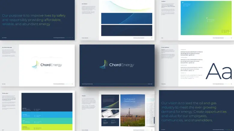
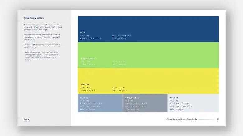
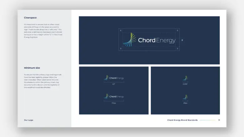
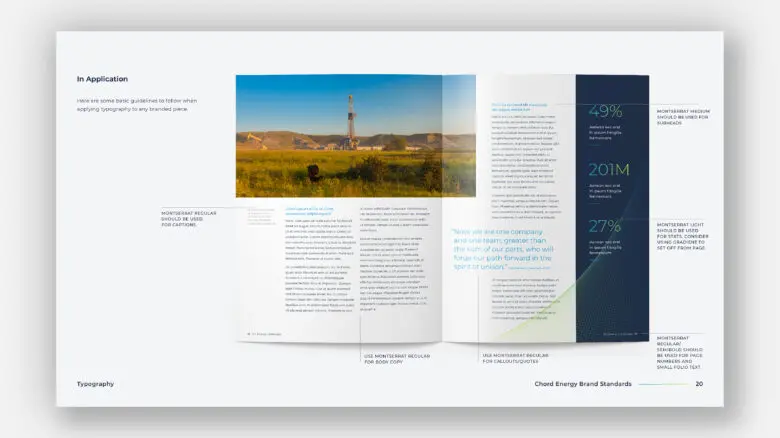
When our clients Oasis Petroleum and Whiting Petroleum announced their merger, the Squires&Co team partnered through research and stakeholder interviews to define new brand messaging that helped define the new company’s mission, vision, purpose and differentiators. The name, Chord Energy, was proposed for its representation of separate entities whose complementary strengths create something more formidable than they did independently. The identity uses line and pattern to convey a sense of movement and balance and a bold color palette that feels modern and ownable.
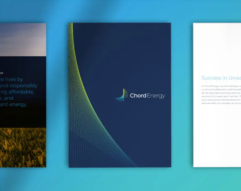
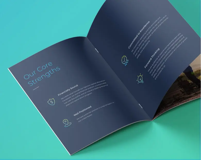
Internal employee rollout tactics and external public rollout tactics were considered on all levels to ensure a seamless new company launch.
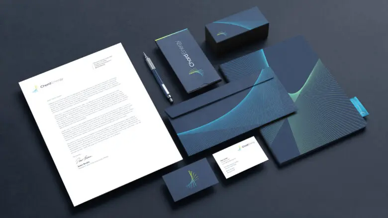

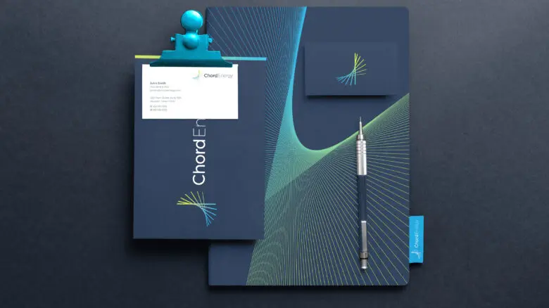
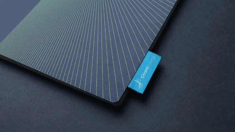

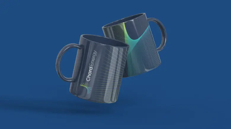







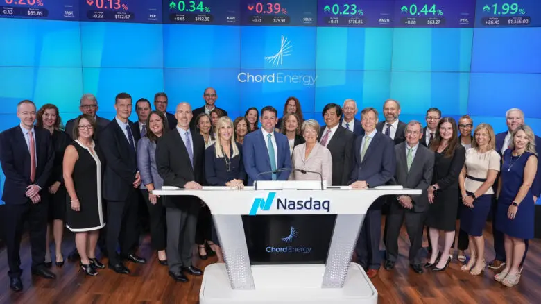

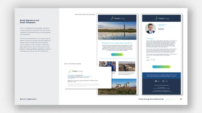
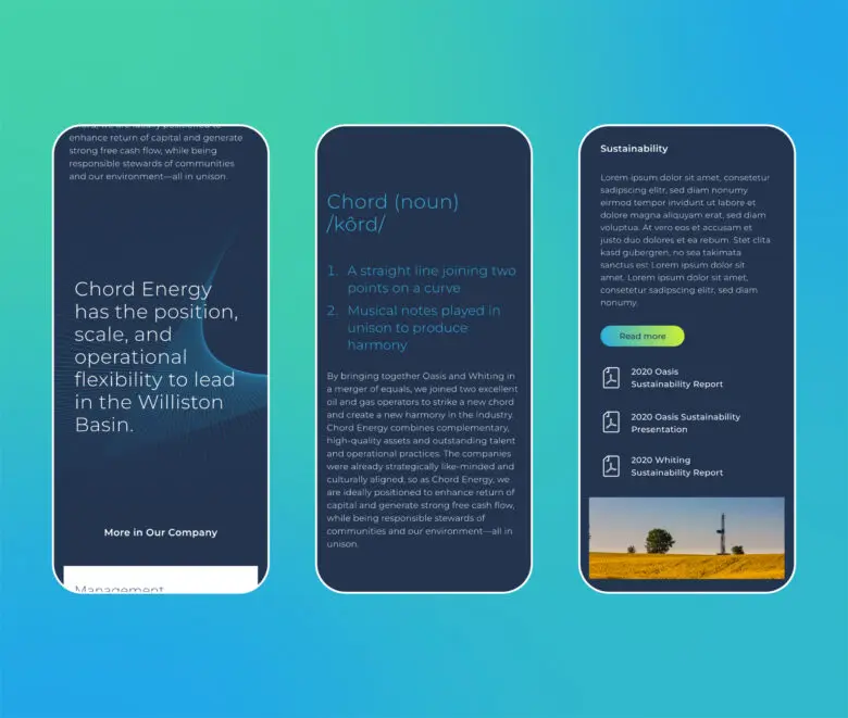
Squires&Co has supported Chord’s rollout efforts with stationery system design, branded swag, graphics and video work for their NASDAQ bell ringing, and their first sustainability report. Chord’s website is a custom WordPress website with an integrated third-party IR section by Cision.

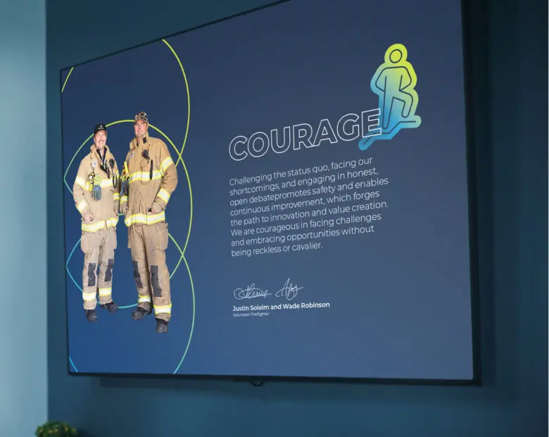
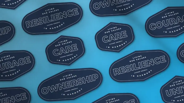
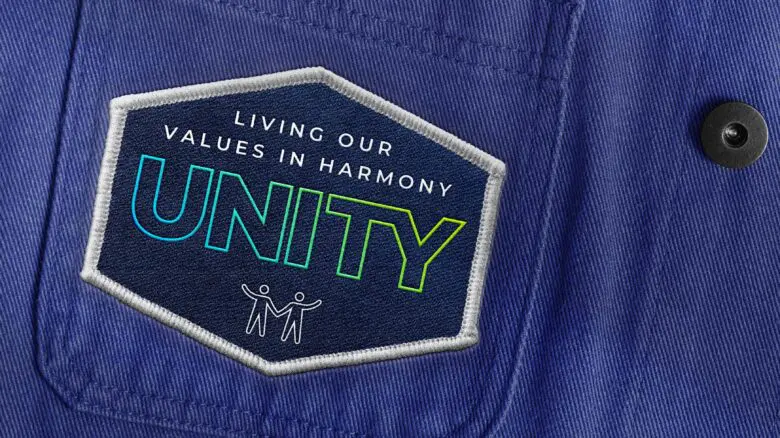
We also built a campaign to raise awareness and reward employees who embody the values that Chord prizes most.

The values campaign extended to the Chord offices with new posters, screen graphics, desktop backgrounds, presentation backgrounds, PowerPoint presentation templates, recognition stickers and more.